Designing to build user trust.
The brief
COMPANY: Cuvva, ongoing project
BACKGROUND: We built a new telematics feature that uses phone data to assess how well you drive. Users can give us location and motion permissions to get a driving score. The better you drive, the more money you save on your policy.
PROBLEM: There is a lack of trust within the insurance industry - with a general perception that insurers are money-grabbers intent on screwing you over. We’ve worked hard to create a better perception at Cuvva through processes we use, customer support offering and of course, our language. But with a product like telematics, where users can’t see what’s happening behind the scenes, we found the levels of trust were waining, with an influx of questions to our customer support team. The questions fell into two categories - “how does this work?’ and ‘how do I know I can trust it?’.
The work
SOLUTION: We designed a dashboard to sit within our ‘Insights’ tab, displaying the data points we held on our users. I chose a 3-pronged approach.
1) Promoting transparency - giving the user greater context by showing them all the information we hold on them and the context around how their driving is being assessed. The aim was to give users confidence in telematics data, and help undo any fears that we’re sneakily collecting data behind the scenes.
2) Creating value - in return for users giving us their data, we’ll give them rich insights that they find interesting and useful. User research found that people are much less concerned about data collection when they get something great out of it (think Google Maps, Strava).
3) Increasing engagement - being upfront about the behind-the-scenes data we hold on them, to increase familiarity, and in turn, trust. Using push notifications, we’ll encourage users to come back to the tab time and time again to see their data updating and get fresh insights.
The aim of this project is to increase the percentage of people signing up to insights and turning on their location and motion permissions, and the percentage of people keeping their permissions on, as this would give us an indication of whether they trusted us.
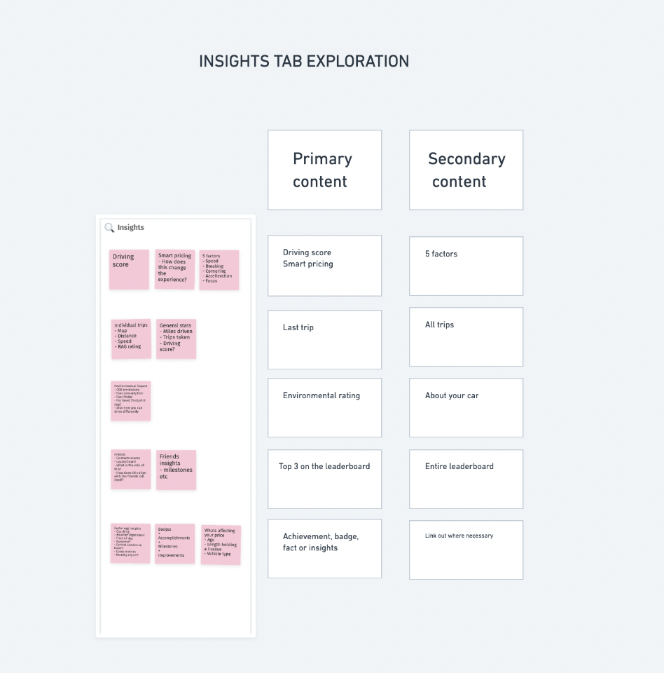
Step 1 - defining the hierarchy
Before designing anything, I mapped out the data points we had to share. I organised them into primary and secondary insights, and started on some simple wireframes to bring it to life.
I thought it would be good to show users individual trips they’d taken, and how it had affected their driving score. This would give them more immediate feedback on their driving and check if everything is working as they’d expect.
I also thought about the data we already held on users. We had an existing tool within the app that pulled data on any vehicle registration a user entered - like the size of the engine, the number of doors, and the latest road tax and MOT information. We’d used this to allow people to sign up for reminders, but it felt like a quick win to add it to this part of the app to quickly populate the tab, increasing the amount of data we were sharing and the appearance of transparency.
Here’s some initial exploration. 👇
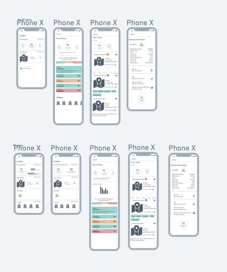
My paired product designer had also spent some time gathering their thoughts, so at this point we came together to discuss.
We worked together to refine and combine our ideas down into one overall solution, and took it to the rest of our team (product manager, researcher, engineers) to get input and feedback. Once we’d discussed technical limitations and agreed on what was and wasn’t possible, the product designer and I went away to create a basic prototype in Figma.
Step 2 - initial user research
We took that prototype to usability testing and got feedback from 5 people in our target audience.
This feedback was a good starting point to create more detailed screens - giving us a good idea about the content, the usability, and the kinds of things people wanted to see in order to create a hierarchy. We found that people were really interested in learning more detail about the specifics of their driving - digging into the 5 factors we use to give them a score, like braking and speed. They were especially interested in knowing where they ranked compared to other Cuvva users.
Step 3 - building on ideas
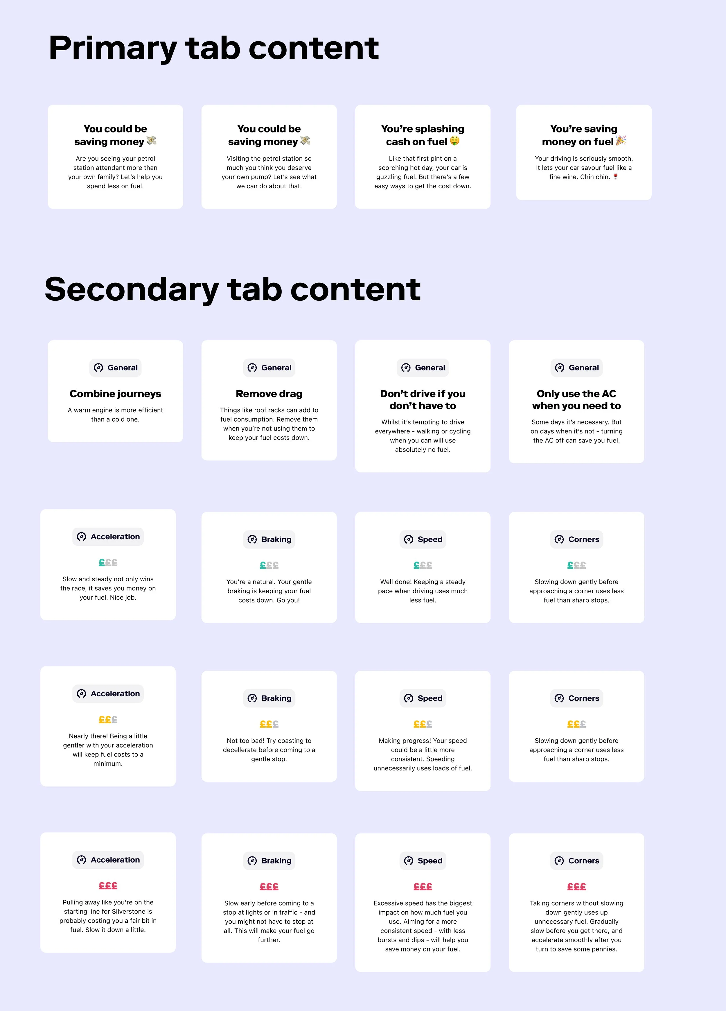
From there, the product designer began creating components for things like the driving score gauge. I continued pursuing interesting and useful data points that we could add to the tab. I discovered that the 5 factors we used to calculate someone’s driving score were perfectly aligned with the advice on fuel saving: a good driving score meant fuel-efficient driving. As we were already calculating this score, we could translate it into a feature that helped them understand how to save money on fuel for very little cost or effort.
As we’d already run 5 user sessions, I asked another researcher to include a small section at the end of some upcoming sessions that were happening for different projects at the time - asking people to rank the different data points we’d included in the tab from most to least useful. Excitingly, we found this was the thing people were most excited to see in the tab.
I started compiling tips that could give our users specific feedback about how to save money on their fuel. Here’s some exploration I have done so far. Primary tab content represents the tile users would see on the tap, with secondary content representing what they would see if they tapped into the tile.
For the primary content, I’ve kept the heading clear and direct so users can quickly understand what this data point is telling them. I have then used engaging and funny copy underneath to entice users to click and engage with the secondary content. Initial qual testing suggests users are really excited about this element of the tab. Hopefully we’ll see the same in quant results when we release it in the app.
This is just one of the ways we designed the Insights tab to meet all 3 prongs of the approach laid out above. By being creative about the kind of content we could share, we were able to promote transparency and add extra value to our users that meant they would be less worried about their data being collected. And we will hopefully see an increase engagement by creating variable reward - dynamic content that updates in the background, that benefits the user every time they come back to the app.
Step 4 - growth and engagement mechanisms
To underpin engagement, I’ve been working on a plan for push notifications and weekly/monthly email reports.
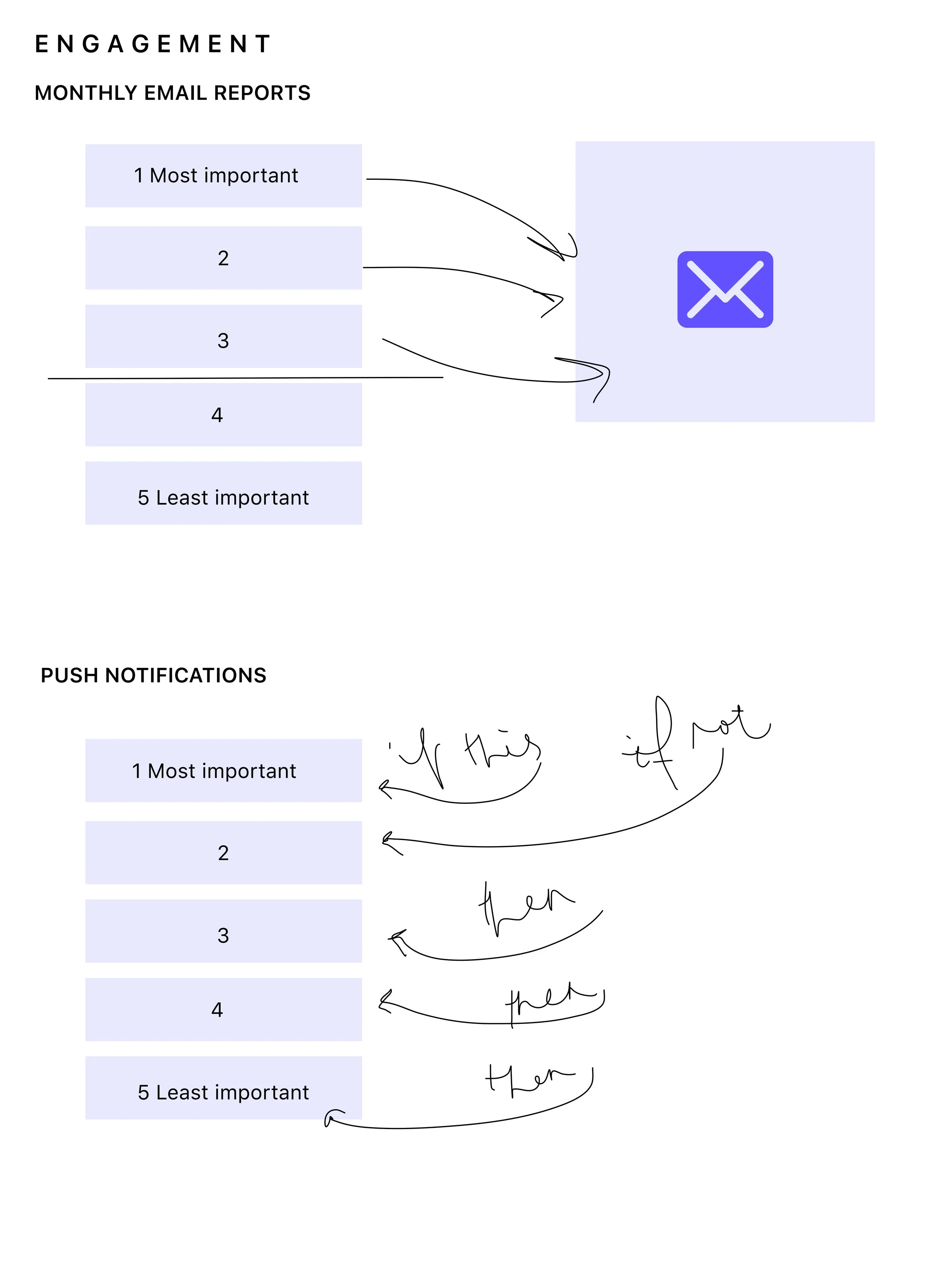
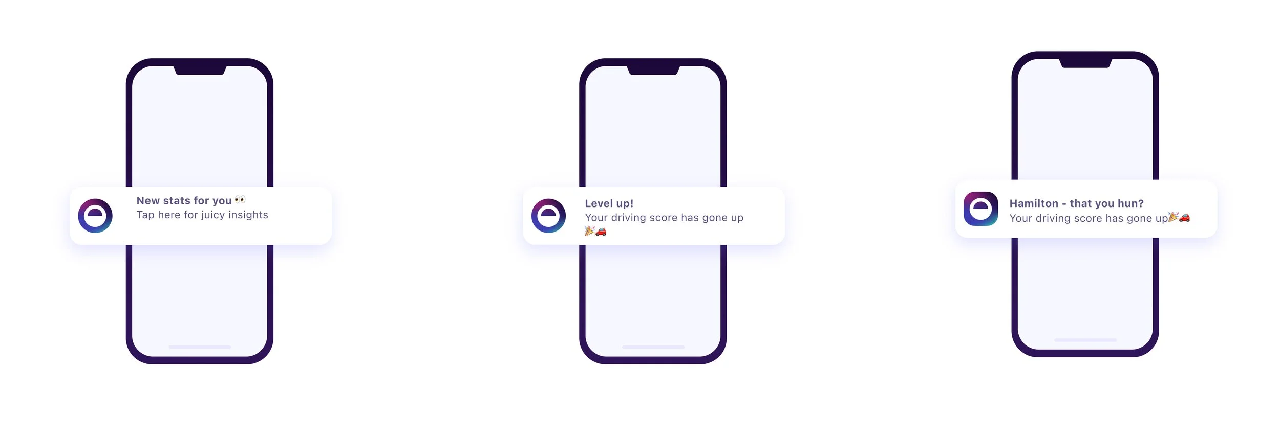
The idea is that the system categorises notifications in order of importance. It only sends one notification a day to begin with, whilst testing optimal settings for our user base. To make sure the notifications are the most interesting they can be, it will try to send out a notification from the most important category first. This would be things like your driving score going up or your price coming down.
If no events have been triggered in this category, it will try the next category and so on.
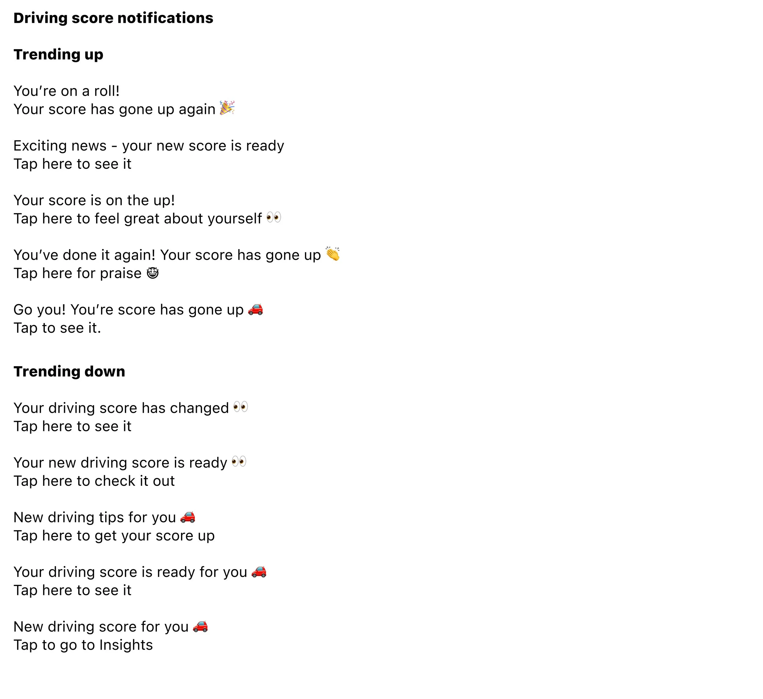
Because we know users become blind to repetitive messaging like ‘your score has changed’, the content within the notifications themselves will be variable - with around 10 different versions of each kind of message. This will allow us to keep them fresh and eye catching, with the hypothesis that this will increase user visits to the tab.
Similarly, we’ll use the data to tailor our messaging to different groups. Those who engage regularly will start to see more fun notifications like ‘Hamilton - that you hun?’ to lean into the engagement and boost the relationship with the user.
RESULTS: This is an ongoing project.