Increasing conversion on a new feature.
The brief
COMPANY: Cuvva
BACKGROUND: We created a new, game-changing monthly car insurance product that replaces annual cover. But whenever a company disrupts an industry, they also disrupt user expectations around how the products and services work. This creates a degree of friction within the product experience that you need to remove, or risk drop-off.
PROBLEM: After several months of iteration on the new product, the intro screens designed to explain it (and remove the friction) had become clogged. With no dedicated content designer on the team, they’d ended up tacking extra lines of copy onto a screen that wasn’t designed to house so much content.
We were finding that users were getting through 3 pretty heavy content screens and still had fundamental questions about how the product worked. We needed to find a way to alter their expectations, and make sure they were well informed about how the product worked before jumping in.
Here’s what we started with. 👇


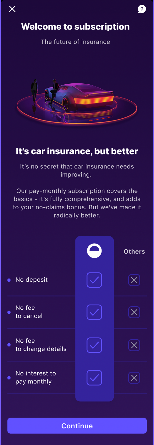
The work
SOLUTION: I designed a new screen that solved both problems. It explained what our product offered, whilst aligning that to the expectations users already had for car insurance products.
Here’s what I designed. 👇
RESULTS: We saw incredible results, with conversion increasing by 17%.
For future iterations, I’d love to remove the image. I feel like it takes up a lot of space unnecessarily, directing attention away from the information users need to buy our product. However that was out of scope for this project.