Building a content design system
The brief
Company: DICE
Background: My role at DICE focuses mainly on the B2B software our partners use to list events in the DICE app. This platform is newer and less refined than the app, and therefore has much less mature guidelines.
Problem: When I joined, I found that terms were used inconsistently across the product, creating a confusing user experience, and meaning our internal teams had to learn several different terms for the same thing - both of which sometimes lead to user error.
The solution
I created a content design system to help us be more purposeful and consistent with our use of language.
When I was researching content design systems, I was seeing the same thing over and over again: a tone of voice guide with a glossary of language that writers could pull from. But it didn’t seem to transfer to other members of the squad. I wanted it to have application outside of the UX writing team - to be useful to product designers, product managers, ux researchers and engineers as well.
I decided the best way to make it useful and get buy-in was to tie it to the visual design system that already existed - pairing language choices to components the whole squad were familiar with.
Here’s what I did 👇
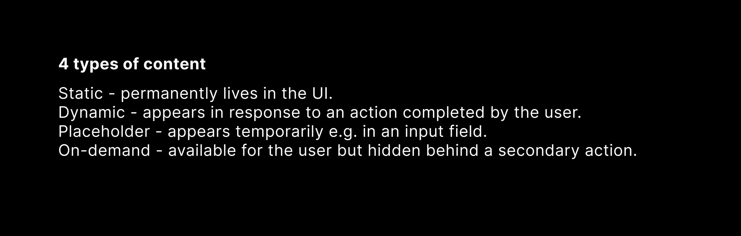
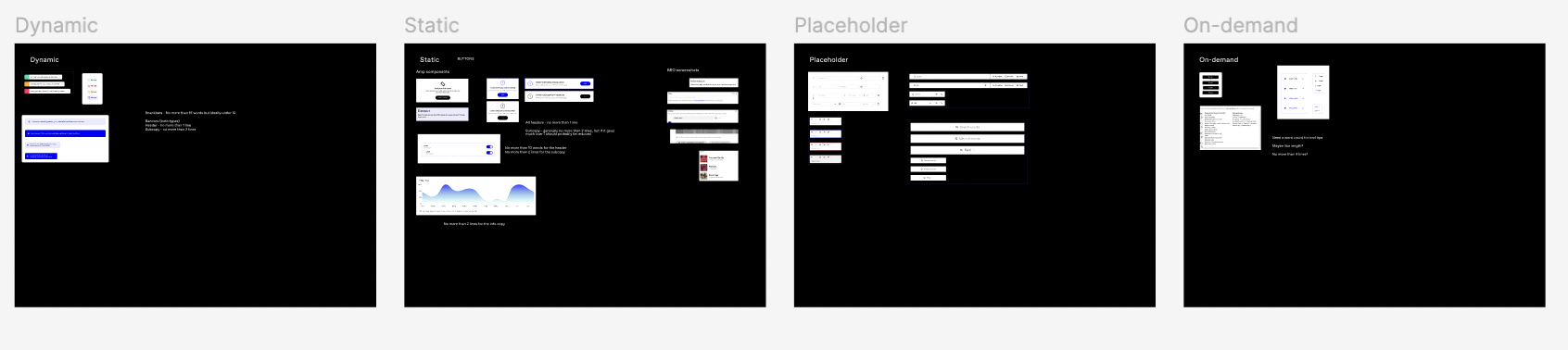
The first thing I did was to define the 4 types of content we used in the product, namely static, dynamic, placeholder and on-demand, and identify which common components we would typically use for them.
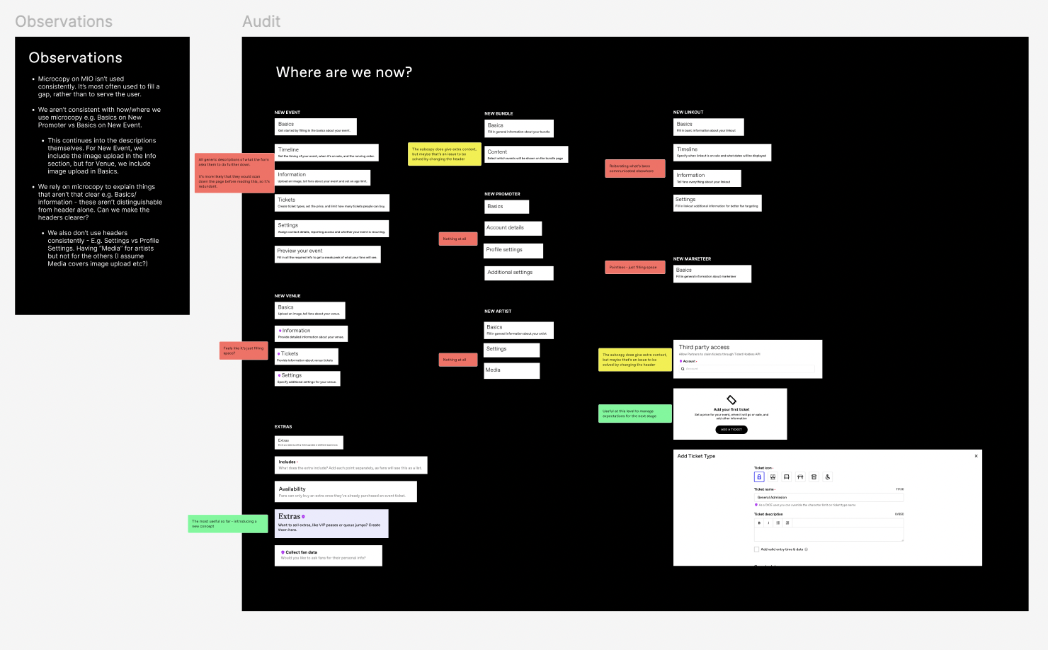
Once I was clear on which components fell into which categories, I completed an audit of the main pages of the B2B platform to see what language we were using with them. I took the main pages of the B2B platform and annotated them, then pulled themes out, to identify our starting point.
I took the learnings from the audit and started working my way through the categories, writing guidelines for each.
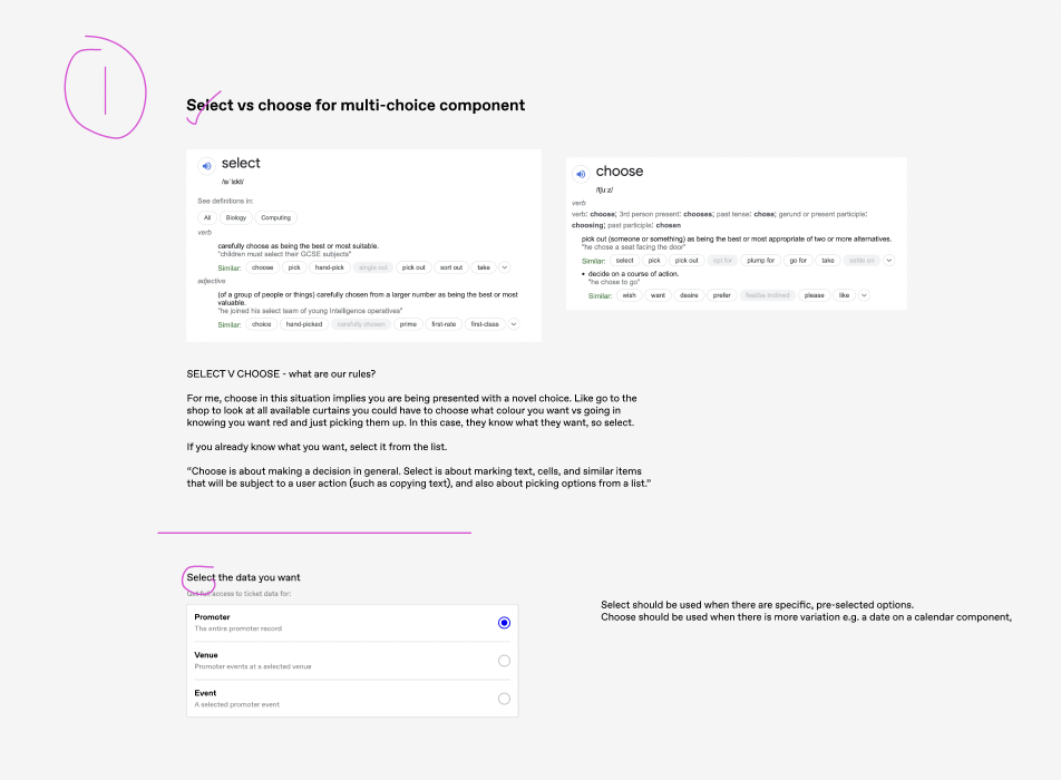
Mapping this work to existing components meant I was able to get really granular with some language choices - for instance deciding to use “select” over “choose” for a drop down menu. This proved to be really useful for designers and engineers - when it came to dev work, any inconsistencies between different Figma files or old versions of the platform could easily be rectified.
And for me as a writer working on the platform, it meant I was able to move really quickly through any component that had predefined language and spend my time on the bigger, juicier content opportunities on the page.
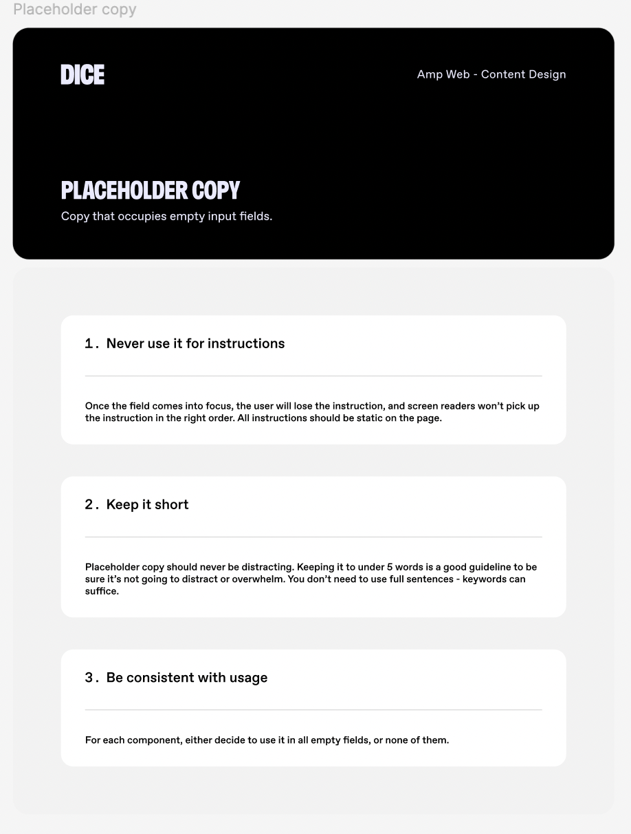
For other component types, I was able to write more generalised guidelines that would help us keep consistency across the board, without needing to be too prescriptive about copy choices and therefore allowing myself (and future writers on the team) creative freedom to still make writing decisions where necessary.
Next steps
It’s still early days for this project (as you may be able to tell from the scrappy screenshots!), but having already seen good results, it’s something I’m definitely keen to continue pursuing. The next item on my list to tackle would be CTAs. I want to create preset button components with the CTAs already built in, so designers can just pull them from the library already written and ready to go.