In-app education flow.
The brief
COMPANY: Cuvva
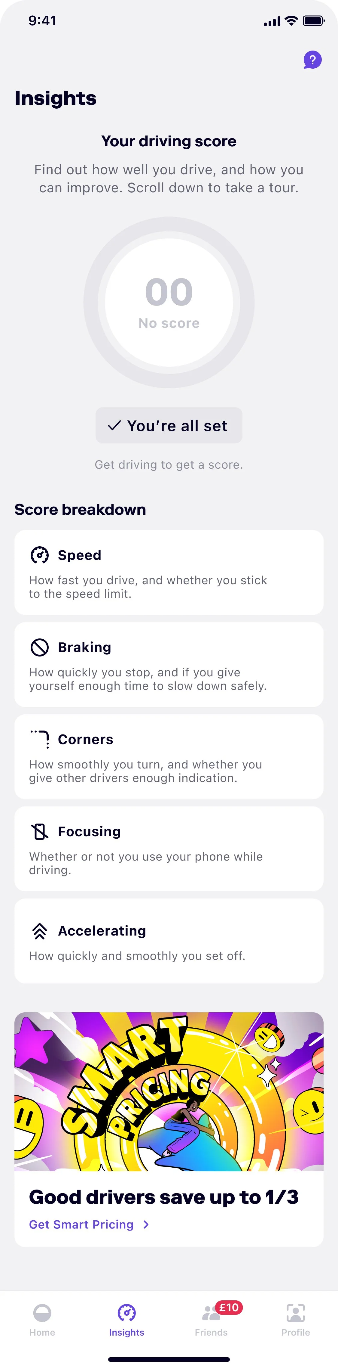
BACKGROUND: Version one of the Insights tab in the app was live in the app - displaying a user’s driving score and related information. Before a user signed up to get insights, they just saw an empty gauge (in place of their driving score) and the factors we use to work it out.
PROBLEM: Whilst we were seeing users sign up to get their insights, we were finding a lot of users were asking questions to our customer support team.
Here’s what we started with. 👇
The work
SOLUTION: We found users had different questions about how it worked, but the main one was about how a driving score lead to savings. Due to the volume, I decided that would be the main focus of the screen.
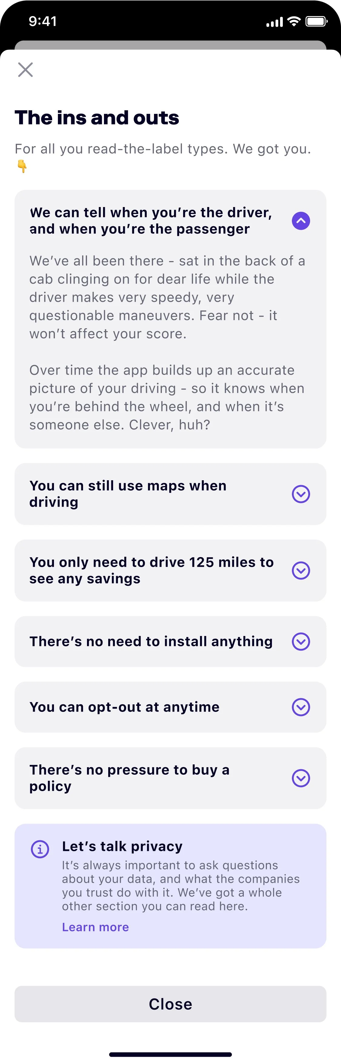
I then went through the other questions, and any that had been asked more than 3 times, added it to an FAQ-style module linked out at the bottom of the screen.
Here’s what I designed. 👇
Note: please ignore the weird emoji formatting in the Figma screens.
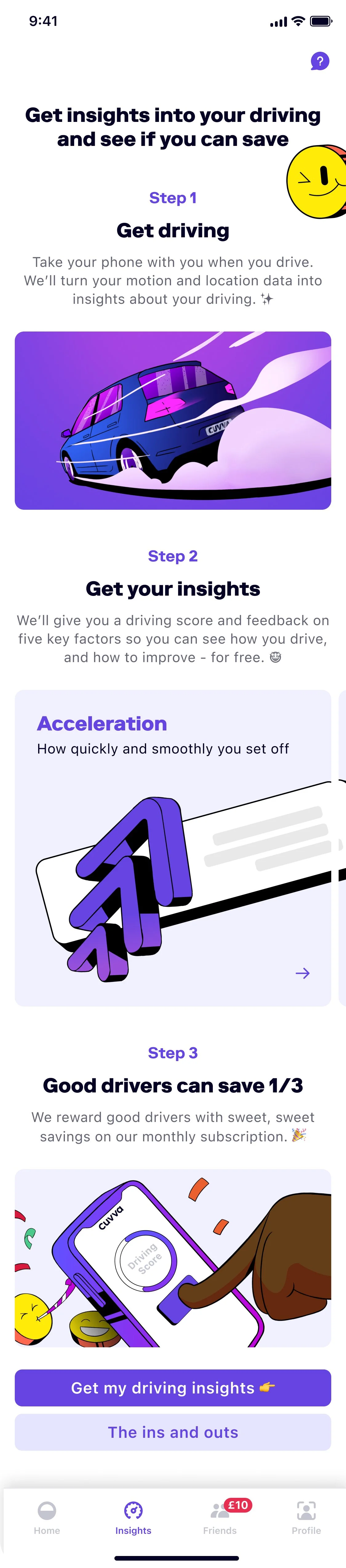
RATIONALE: When a user lands on the Insights tab for the first time, they get this screen. We opted for one long screen over a paginated approached because the next step in this flow is a very long 9- screen process to turn on the relevant permissions. Overall, it would have felt too many screens for users.
Additionally, we know a lot of users like to skip these bits - just get into the product, have a play around, and figure it out themselves. A long screen with a sticky button means they aren’t blocked by several pages - they can just get going. To further meet this need, I made sure step 1 was a sufficient summary of the offering so our skippers could still benefit.
In terms of the FAQ section, I made the decision that it was the best way to meet user needs. Whilst this form has been criticised in the past - claiming it indicates a badly designed experience to leave a user with questions - users have come to expect, and even look for, FAQ sections. We found this could keep the intro page clean and exciting, but still give the right amount of information for users who wanted to dig deeper.
And I wanted to do the best possible version of an FAQ screen. So rather than phrasing the titles as questions, meaning users had to open the modals to get the answers, I wrote the answer into the titles. This way a user can skim down the list, answer all questions immediately, and only need to read the sub-copy if they wanted a little more.
Finally, so that the skippers don’t end up back in our customer support chat queue, we also added the ‘ins and out’ section to the main tab itself - so anyone can access that information at any point in the flow.
RESULTS: This build is currently in-progress.