Launching a new service.
The brief
COMPANY: Mojo
BACKGROUND: Mojo is an incredible wellbeing platform designed to help men overcome erectile dysfunction without the use of meds. When I joined as a freelancer in early 2020, the founders were working towards getting the site live. They had identified 9 topics of education for the platform, but only aimed to have 3 ready in time for the launch. They also wanted me to boost the numbers on the waitlist.
PROBLEM: As a new company tackling a really difficult and sensitive subject in a population who have been taught it’s not okay to show emotion and weakness, getting the language right on this project was crucial.
The work
PROJECT ONE
The founders had paired with a local NHS mens health unit to do some research, so had spoken to several men about their experience before I joined. Luckily they had audio recordings, so I could listen to the language the men were using and look for common themes.
The main thing that jumped out to me was an awkwardness around clinical terms like ‘erectile dysfunction’. The founders themselves said they didn’t relate to that terminology - it brought to mind men much older than they were. It seemed pretty common to use colloquialisms to get around that, and seemed to make the men feel more comfortable within the discussions.
Similarly, men seemed to be pretty exhausted by their situation. Anecdotal evidence from the experts on our team stated that men usually struggled with problems in silence, trying ‘quick fixes’ or hoping it would get better for a while before reaching out for help. So rather than trying to use complex terminology like ‘psychological’ to explain what the platform did, we kept it super simple. This way, we built intrigue so that when the content was ready, men could see for themselves.
For the landing page, I leant into both of these findings.
Here’s what I did. 👇
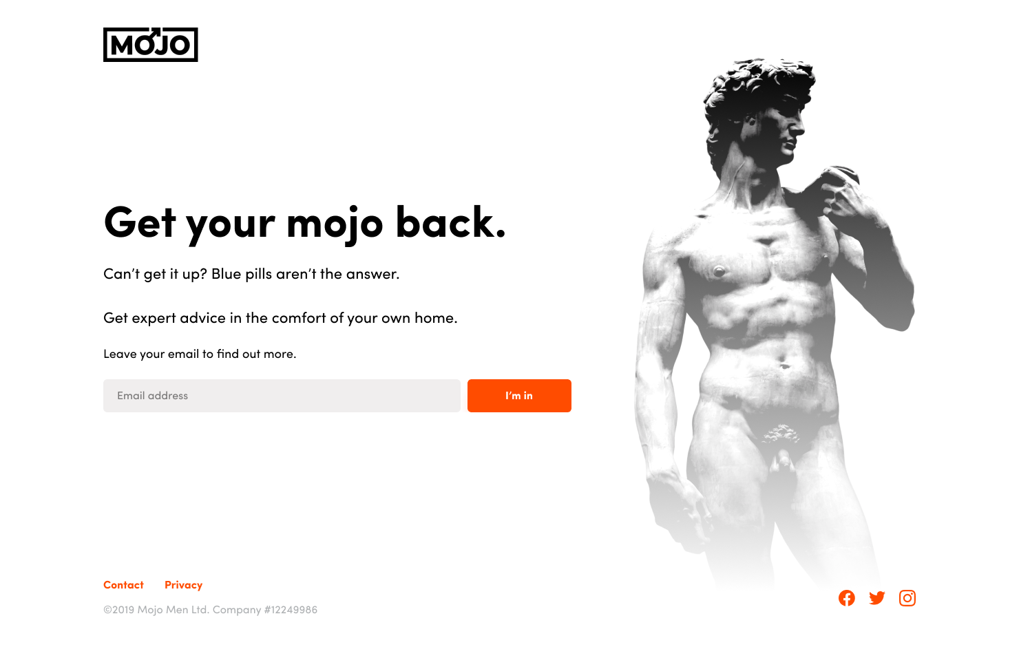
With the new landing page content we saw a 13% increase in waiting list sign-ups.
PROJECT TWO
Alongside the landing page, we worked on creating a template for each of the 9 topic pages. All 9 pages would include an intro to the topic, a video from an expert designed to feel like a consultation at a doctors, including some follow up exercises, and stories from men who had experienced similar.
As we were only working on 3 of the pages, I needed to consider the content across all 9 potential pages (and additional future pages) to make sure the design would be future proofed. Getting the right structure in place would be crucial.
But more importantly, creating a solid structure would reduce cognitive load. We know that the users of the Mojo platform are vulnerable, engaging with content that may trigger or upset them. My role as a content designer was to help guide them gently and make this experience as easy as possible. Structuring each topic page in the same way creates a pattern that users can quickly get used to - knowing which sections contain which info, and allowing them to navigate in a way that suits their own personal journey.
Using the learnings from the previous research, I named the sections
1) The low-down - a written introduction to the topic, and any relevant expert videos
2) The how-to - follow up exercises to help men overcome their problems in the bedroom
3) Full disclosure - stories from other men who had gone through exactly what they had, related to each topic
User research found that the section names were both relatable and descriptive - they felt the language was approachable and relaxed, like talking to a friend, which made them more likely to check out the content and give it a go. It worked so well that the sections still follow this structure now (December 2021).
Given this content is sensitive and behind a paywall, I am unable to share samples of the pages.