Expanding into commerce
The Brief
Company: DICE
Background: DICE has made a name for themselves as a ticketing app. A firm favourite amongst fans, they have gained trust as a fan-first app that users can trust above competitors. There’s a huge opportunity to boost artists’ and venues’ sales by selling merch and other such “extras” like drinks packages or parking, on top of tickets to events.
Problem: The DICE infrastructure wasn’t set up to be able to sell things other than tickets.
Solution: Working on the B2B partner platform (MIO), I was the sole UX Writer tasked with creating a new flow within the platform to allow partners and internal users to list and manage sales of merch and extras. Let’s specifically look at the flow we designed to add merch.
The work
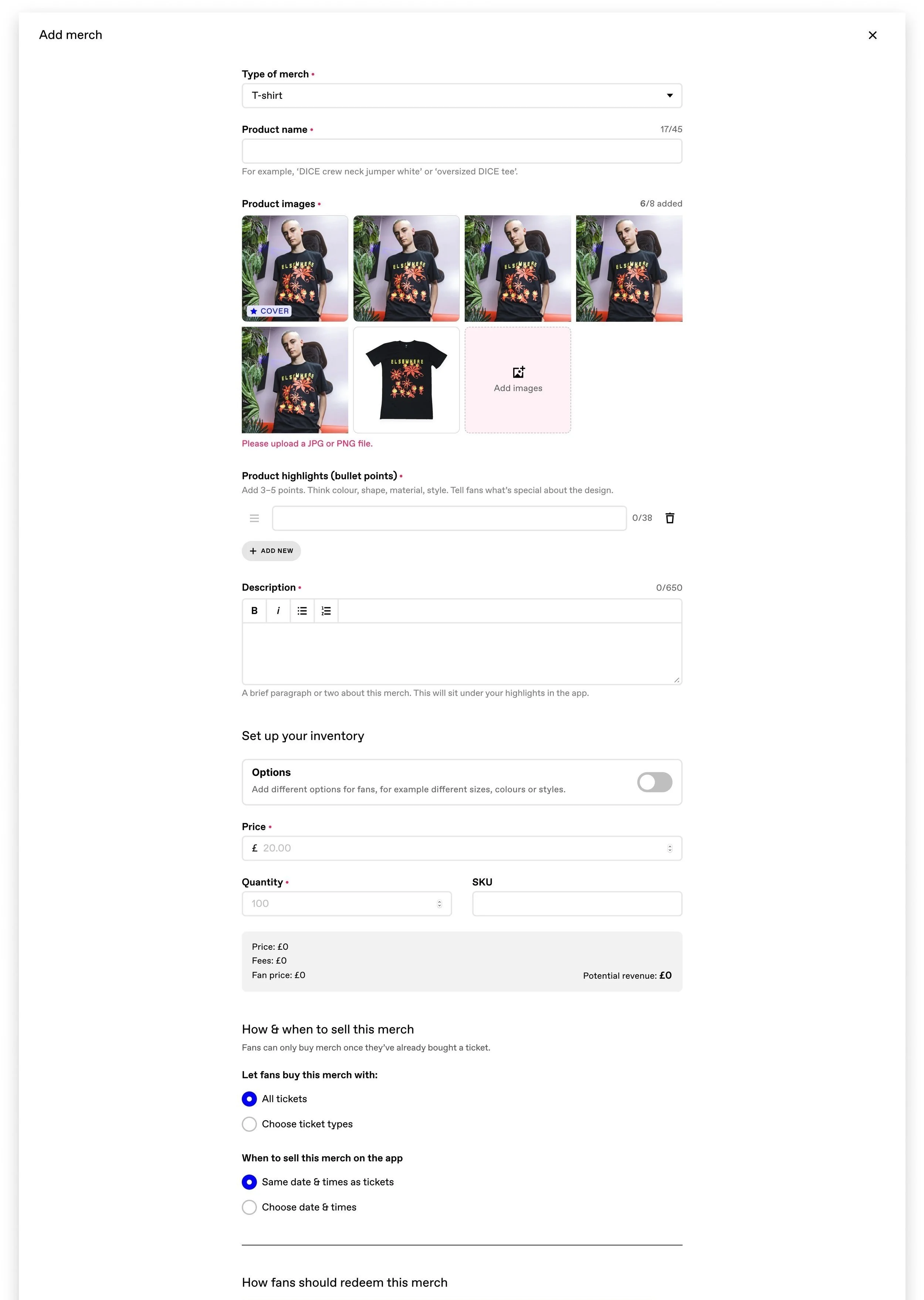
Here’s what we designed, with a breakdown of some of the work involved 👇
Section headers
We used the same format we had already designed for creating an event, listing ticket types etc.
When writing headings for forms, I always aim to be super clear about what each section covers. Snappy, one-word section headers are great visually, but with long, complicated forms, it’s best to be super clear what each section contains.
I’ve used descriptive headers like “How fans should redeem this merch”.
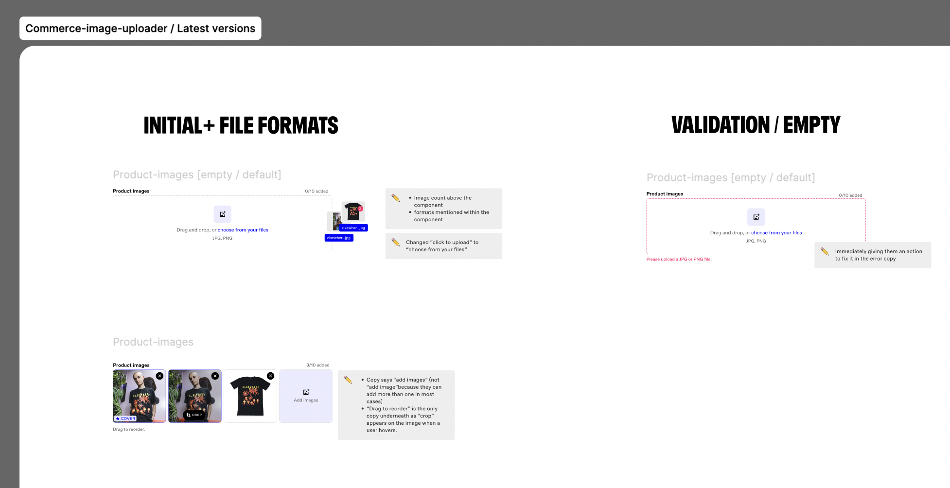
Error messaging
When it comes to writing error messages, I aim to empower the user to fix the problem as soon as possible. This means removing any unnecessary copy like “sorry” where the situation doesn’t warrant it.
Here, the error message simply tells the user what to do to fix it - without slowing them down.
Testing language choices
When it came to the “set up your inventory” section, the team had different opinions on the use of “options” as the toggle component header.
My paired designer felt really strongly that we should use “variants”, presenting definitions he’d found and a compelling case for why variant would technically be the right way of describing the same item in a different colour, say.
However, I was keen for the experience to be consistent no matter the product or experience we were selling. It might be a choice between a green or pink t-shirt, but it could also be a choice between car park A or B. For this reason, and to keep things simple and colloquial, I’d felt strongly that we should use “options”.
It was an interesting challenge for us to consider. I looked at other e-commerce platforms and found both variants and options were used elsewhere.
I wrote 3 versions to present to the UX Writers - one using “options”, one using both “variants” and “options” (where “options” was used as a secondary term to add some clarity to “variants”), and one using “variants”. I didn’t offer up my opinion until they’d had a chance to review and decide their preference so not to sway them. They unanimously agreed “options” was the best version.
I also spoke to our account managers to see what language came up when discussing this new feature with partners (both anecdotal evidence and scans through emails), finding that “options” was the natural language used.
Ultimately, swayed by this feedback, I followed my gut and went with “options”. I decided that it was better to use colloquial language to make it quick and easy to understand, than it was to be “technically” correct.
Handing over to the devs
As this was a big project with lots of input from both myself and my paired designer, I made sure to write coherent notes for each screen and component so that other members of the squad (like engineers and the PM) were able to see exactly what decisions had been made and why.
When it came to build, engineers could move quickly and resolve issues themselves if they found the odd discrepancy. Doing this made a huge difference - conversations in stand ups ran so much more smoothly with the right context for everyone, and I found so many fewer mistakes when I came to QA the designs.