Making data more accessible
The brief
Company: DICE
Background: DICE is a ticket sales platform that makes it “weirdly easy” to go the events fans love. Because of our brand recognition and incredible user experience, partners that list events through DICE can often attribute a good percentage of their sales to DICE-owned channels - including our app, website and marketing efforts.
Problem: This data wasn’t readily available to our partners, so in some cases, they weren’t fully aware of the benefits of listing their events with DICE over our competitors. This created extra work for our Account Managers when trying to renew deals or win new business, as we didn’t have tangible figures ready to demonstrate.
The solution
We decided to build a dashboard in our partner platform (MIO) to show our partners their sales attribution - meaning what percentage of their account sales could be attributed to which channels. My job was to build the messaging around this - to take numbers and turn them into a human-centred narrative so that our partners could understand the benefit of using DICE.
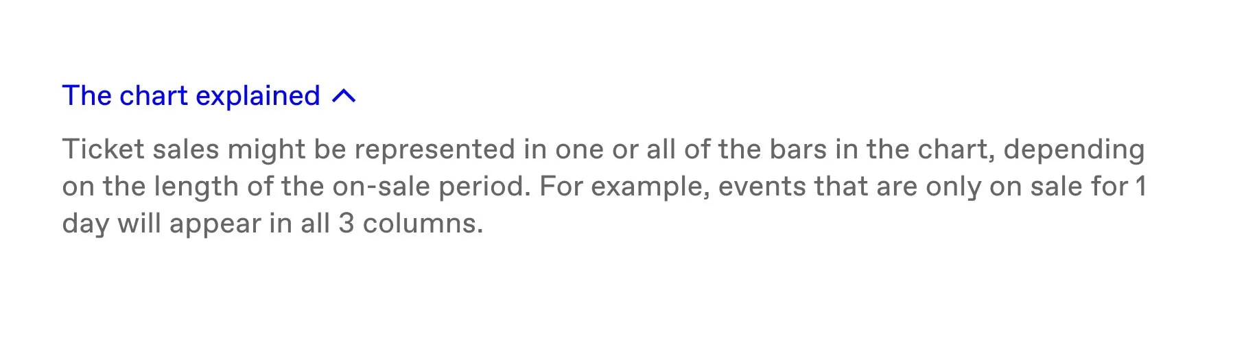
Here’s what I designed 👇
The biggest issue I was grappling with as the UX Writer on this project was telling a story effectively with the data. This meant making sure we demonstrate the value we’re adding to our partners in a clear, easily digestible way, using as little copy as possible to avoid overcrowding the page.
The first thing to get right was naming the different data points using clear labels. This meant working closely with the data team to understand the different data points we had available, and grouping them in the right way to make each one super valuable.
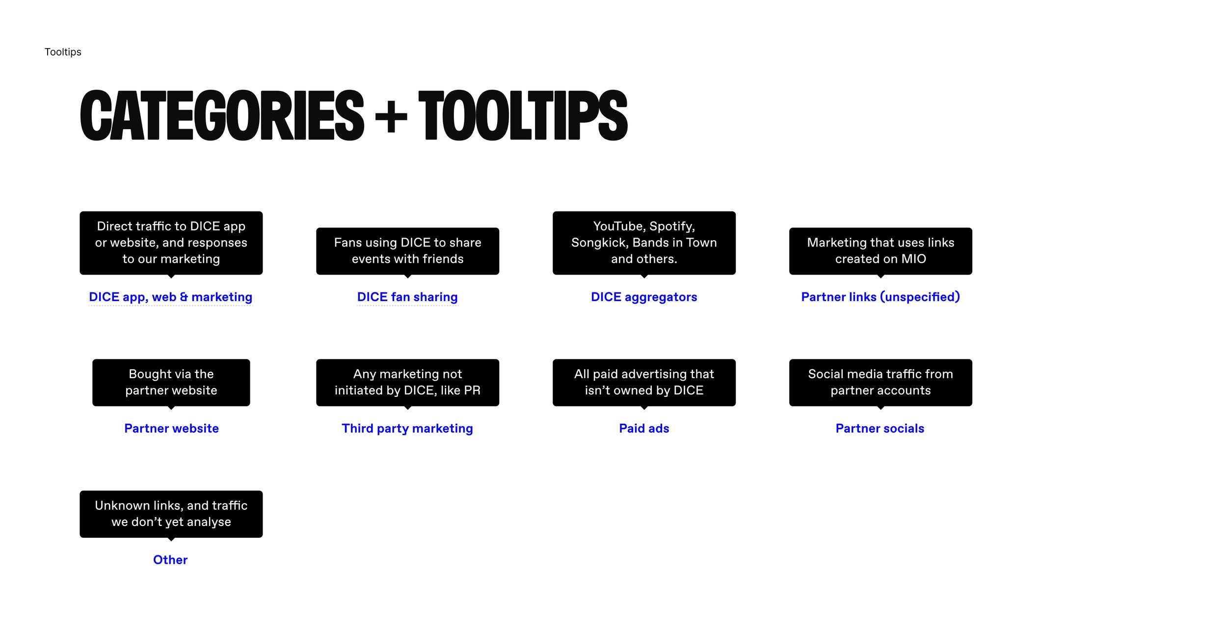
A good example of this is the grouping of “DICE app and website” and “DICE marketing” together. Initially I had them split out, but speaking to our Account Managers, I discovered that partners weren’t bothered about the split between organic sales and marketing-driven sales, as much as they were the overall value DICE was adding.
I had to make sure that anyone accessing this page would be able to understand what the data was telling them. However, any one partner company may have several different team members accessing this information. I had to make sure that anyone accessing this page would be able to understand what the data was telling them. But at the same time, we didn’t want repeat users to become overwhelmed by seeing the same information time and time again.
So I chose to use on-demand content (in this case, tool tips) to make sure explanation was available where necessary - but for those users coming back to the page to check progress overtime, the page wasn’t overly clogged or busy.
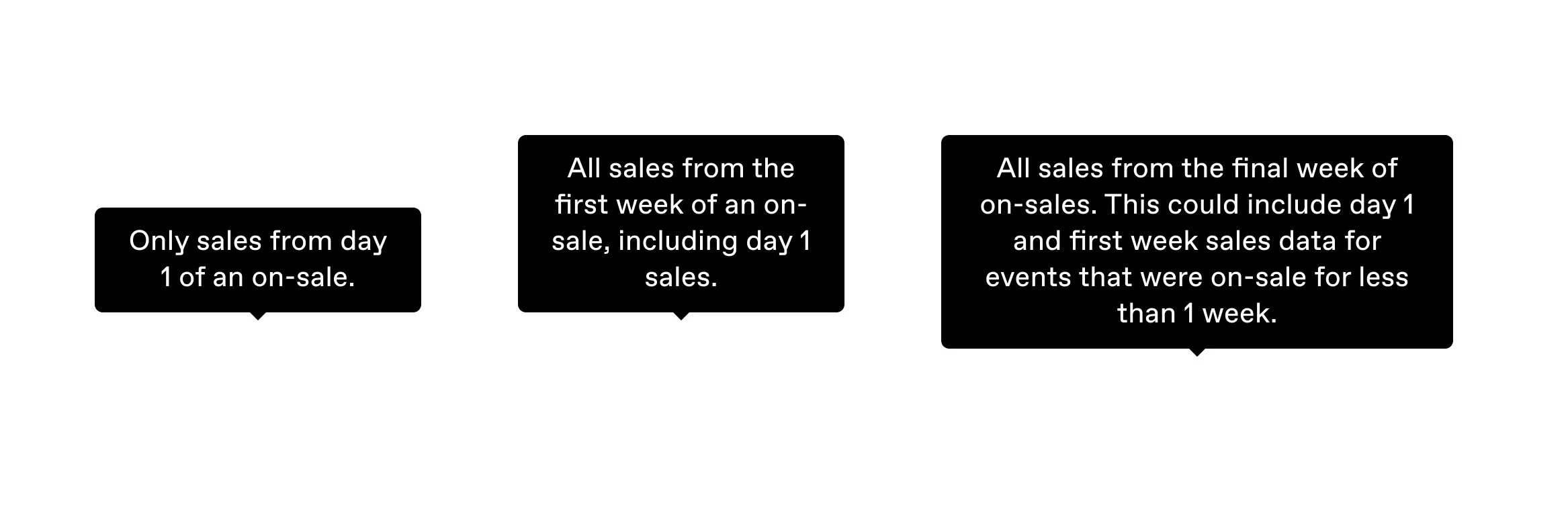
The second thing was making sure the hierarchy of information was right so that users could scan the page, and quickly put two and two together. This meant thinking about the design and the order of information presented.
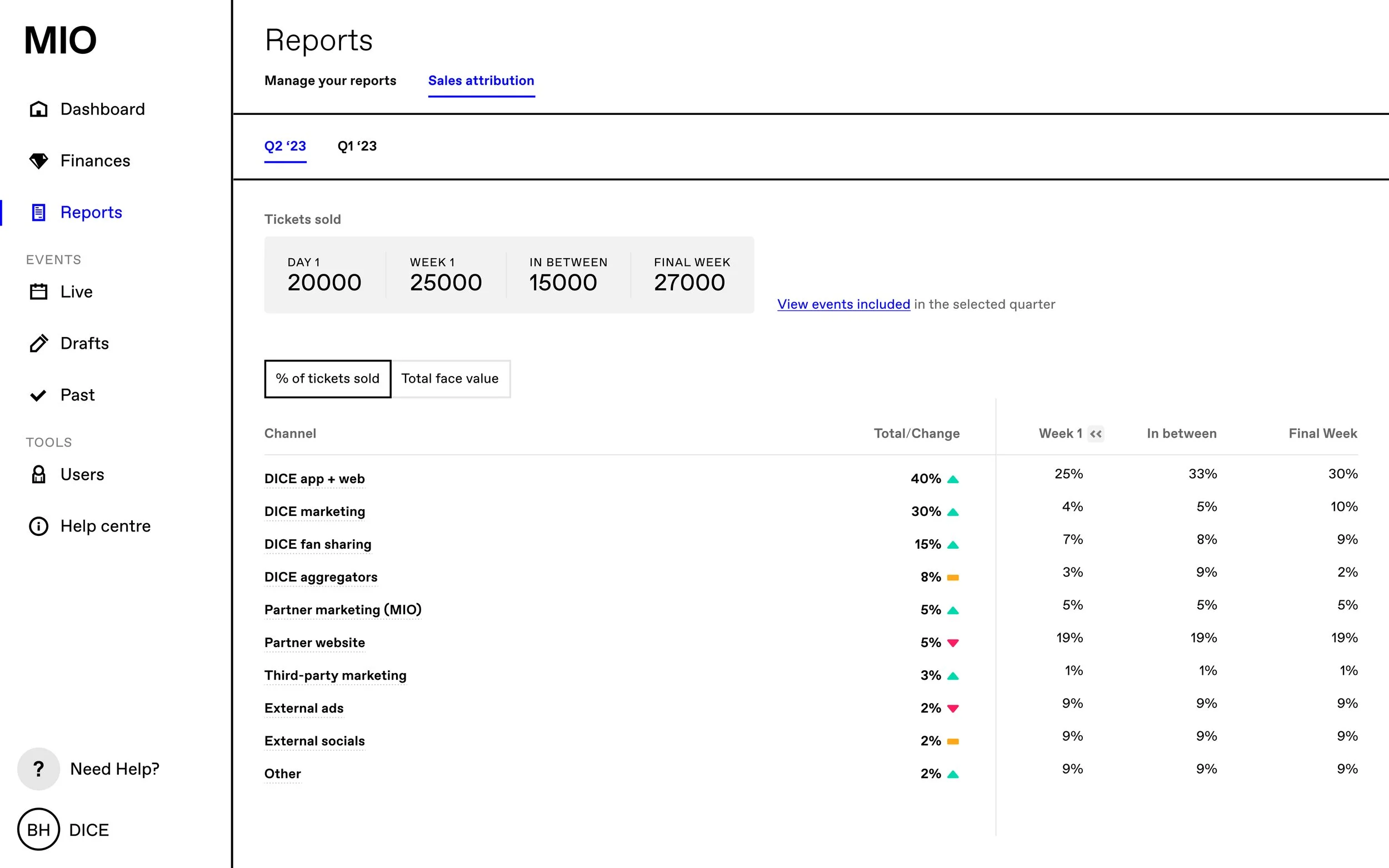
We started off including all information in one table - but this lead to some confusion. Including standalone figures in adjacent columns made it look as though they would add up to make a whole. In some cases, the data would overlap (for example, day one sales would also be covered in week one sales).
After workshopping this for a while I found it was near impossible to explain it in a concise, easy-to-understand way. This usually means one thing - there’s something wrong with the concept. It became a lot easier to explain the data separately - total attribution across their account for all events, and attribution at different points in the on-sale cycle. For this reason, we split out the data into two separate visualisations.
I think this is a great example of prioritising clarity over all else when it comes to UX. There’s a lot of discourse in the community that less is better, no-scroll is better. However in this case, having two separate visualisations allowed us to meet our partner’s needs much more effectively.
✨ After✨
Before
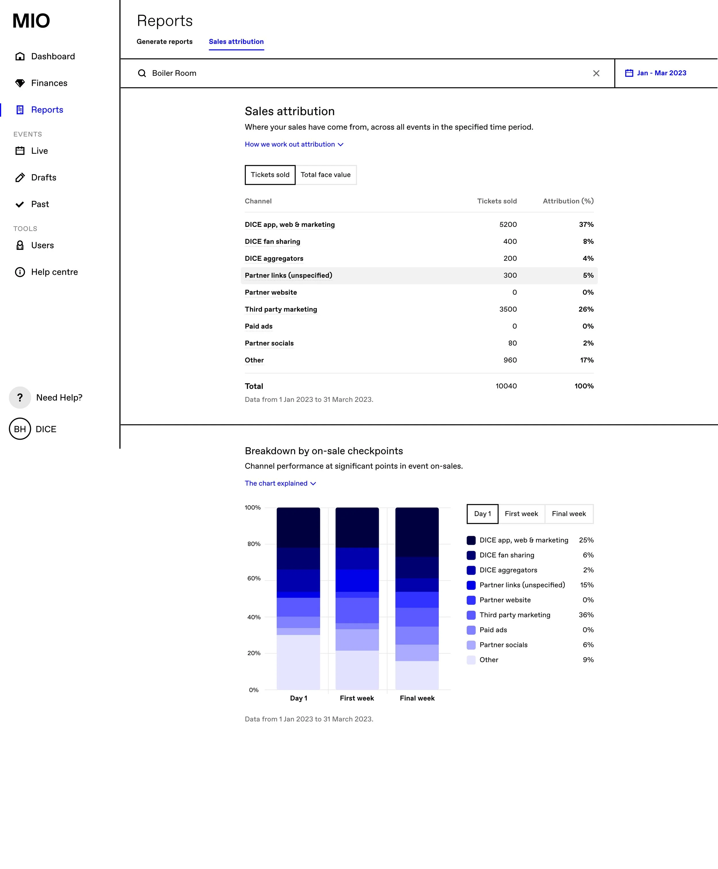
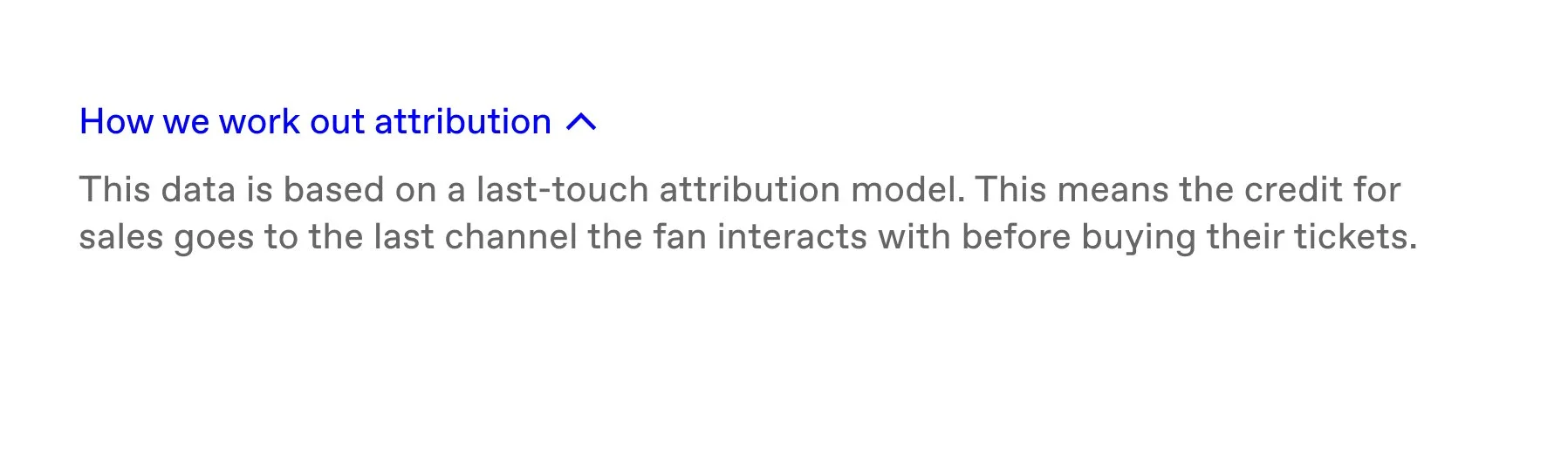
In this second iteration of the design, I used the same principles of applying on-demand content. I used a drop-down component to explain the chart, and for extra clarity, I went in with tooltips to make sure the partners understood what each of the tabs within the “Breakdown by on-sale checkpoints” chart was telling them.
The feedback we got from partners and from our internal team was incredible. We’d helped our internal team have better conversations about performance when it came to renewing contracts or selling DICE to prospective partners.
And our partners were really grateful to be able to see how all of their channels were doing - including non-DICE channels - to track and improve their marketing performance over time.